Toy stores provide plenty of opportunities for young children to learn and explore through play. But why do we stop playing when we grow up? Out of the Nest is an eCommerce site that provides opportunities for lifelong learning and self improvement.
The Process
About the Business
Rhen’s Nest is a toy store in Ponce City Market dedicated to fostering creativity and a sense of play.
The User
Since my user was a parent, i created an experience map to better understand the process of raising children and the pain points associated with it. As expected, the teenage years proved to be a challenging time. In my research about psychosocial development, I learned that kids who maintain a good relationship with their parent or caregiver during their teenage years grow to be more successful adults.
The Solution
My solution was to create an eCommerce site with crafts and activities geared towards a more developed mind. The goal was to give parents the opportunity to continue to bond with kids as they get older, and give Rhen’s Nest the opportunity to maintain lifelong customers.
The Products
My criteria in selecting the products was that they should improve the life of the user. This means not just toys, but activities that would allow the user to foster creativity, develop life skills, cultivate healthy coping mechanisms, and even explore potential career opportunities.
Cardsorting
Through a series of open and closed sorts, I determined the most intuitive organization for the site map
Site Map
A few categories had a broader range of materials, so I conducted mini-sorts to determine subcategories.
Tentative User Flow
Highlighted in green is the checkout path. My hope was to make this happen in as few clicks as possible.
Competitive Analysis
In my competitive analysis, I compared hobby shops because some of the products are similar, and toy stores because the shopping and checkout processes are similar.
Key takeaways were that simple navigation and access to information makes a site intuitive and accessible.
Sketching
As a continuation of my analysis I sketched some competitor pages to get an idea of layouts and elements. Key takeaways were alternative views, recommendations and access to social media and wishlist.
I then used the information I learned through competitive analysis and sketching to inform my own layouts.
Wireframing
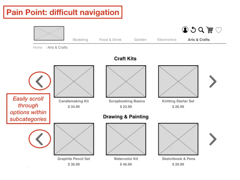
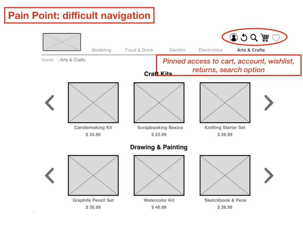
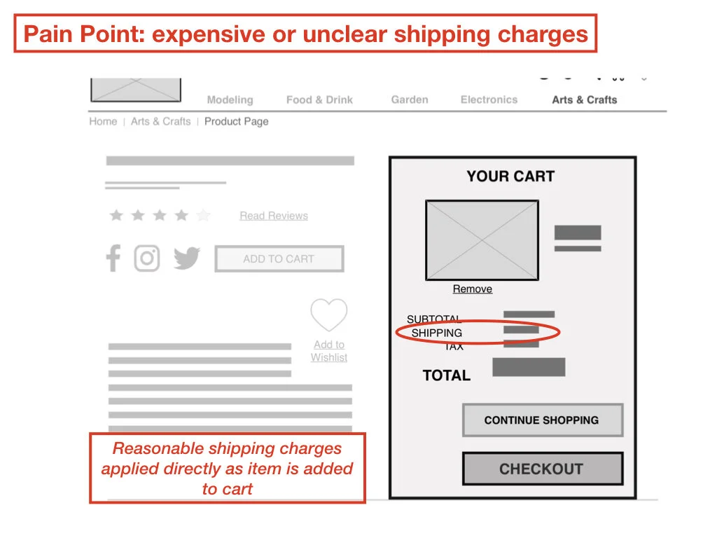
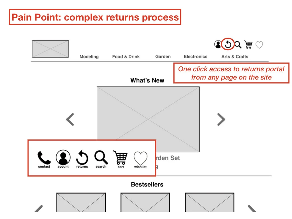
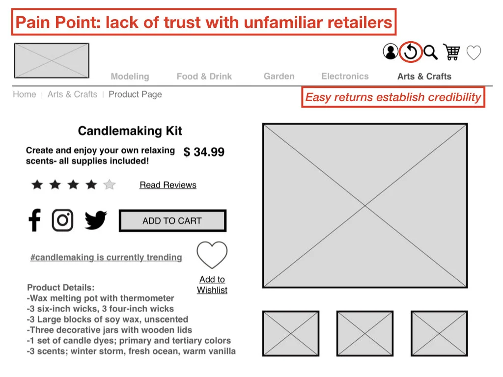
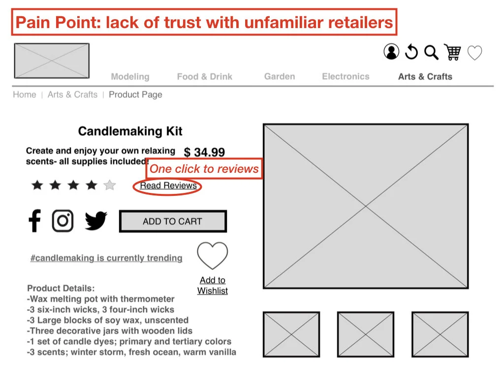
I made sure to address my user’s pain points as thoroughly as possible as I built my wireframes.
User Testing
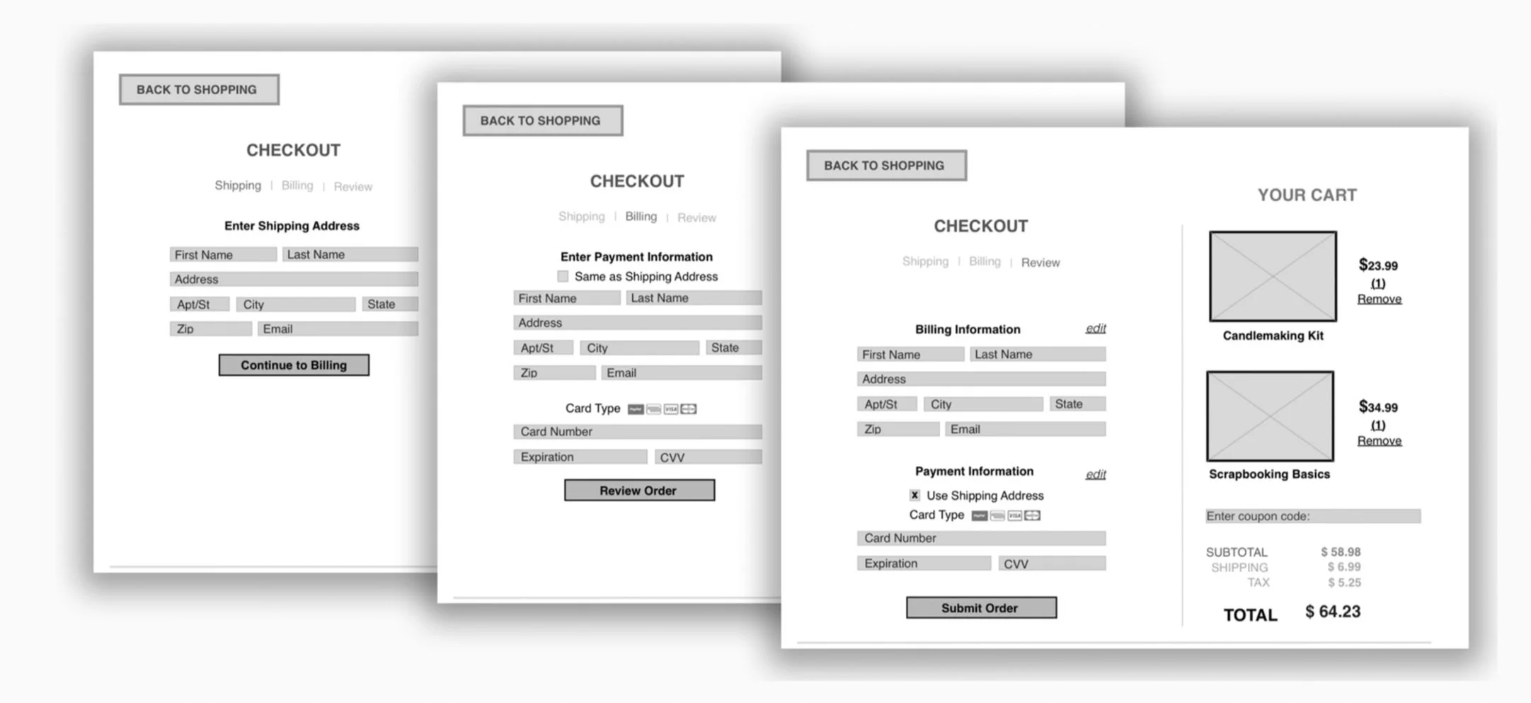
The most significant feedback I received during user testing involved the checkout process. Users were overwhelmed by the quantity of information on the page.
I broke up the checkout process into smaller sections and added breadcrumbs for simpler navigation.
My takeaway from the testing process was that simplicity does not necessarily mean fewer clicks; content matters.
The Prototype
Key Screens
Next Steps
Continued user testing and revisions
Simplify experience for account holders
Establish social media presence
Funding
Product development
