Sunnyland Farms, a 71 year old pecan company, has historically been catalog-based. As the business evolved, they have made an effort to transition their users into the modern world. I worked with a team to bring the conversational and curiosity driven nature of catalog browsing to the Sunnyland Farms website.
The Process
Business Needs
After speaking with the COO, CMO, developer, and doing a survey of call center agents, a few goals and priorities were determined. They included:
Increase conversion rates
Decrease abandoned carts
Maintain brand image
Decrease website related calls to the call center
Maintain SEO keywords and content
Maintain site speed
Customer Demographics


A survey of customers revealed that 70% are seniors, and that they tend to purchase both for themselves and for others. The majority of customers make purchases online using desktop computers. However, user interviews revealed that though many users do order online, they tend to browse the catalog before they order. Additionally, no users reported browsing the website- they tend to go to the site knowing what they want.
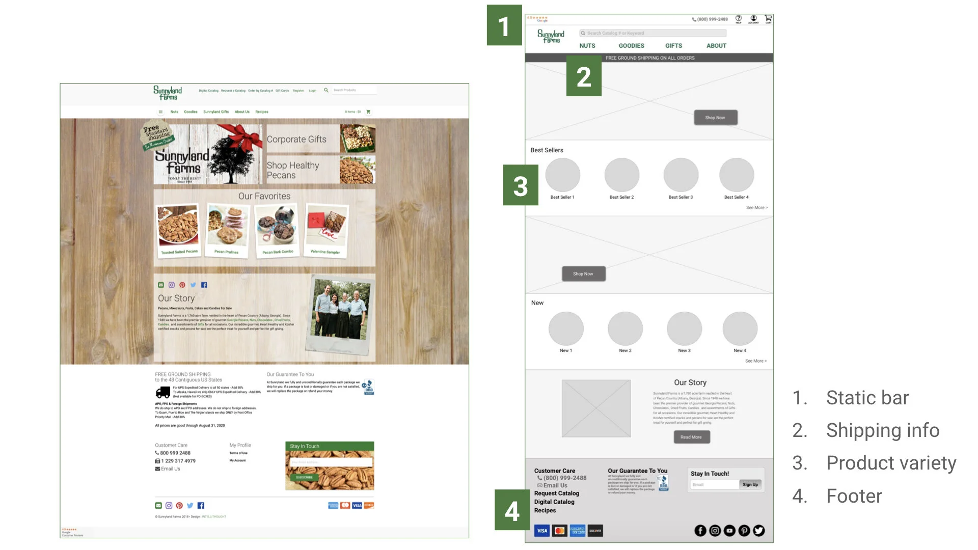
The far left in this image is Sunnyland Farms- this analysis of home page layout indicated an overwhelming lack of content compared to competitors. Usability testing also revealed that the current information architecture made navigation confusing.
Usability Testing
Through a series of remote and in-person usability tests, key struggles were uncovered. They included:
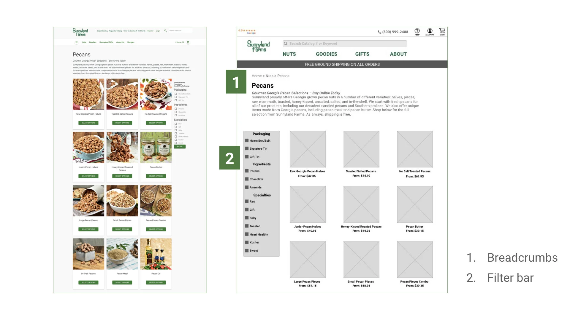
Confusing navigation due to dense IA
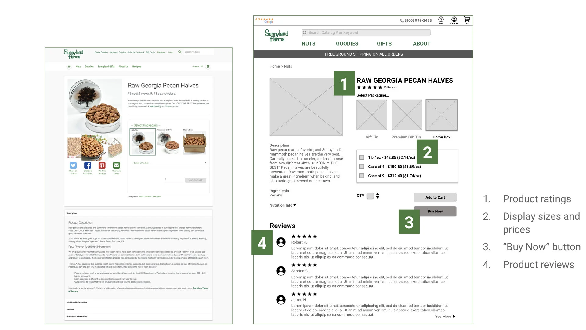
Lack of clarity in prices
Lack of content on home page
Packaging selection option on product page was not clear
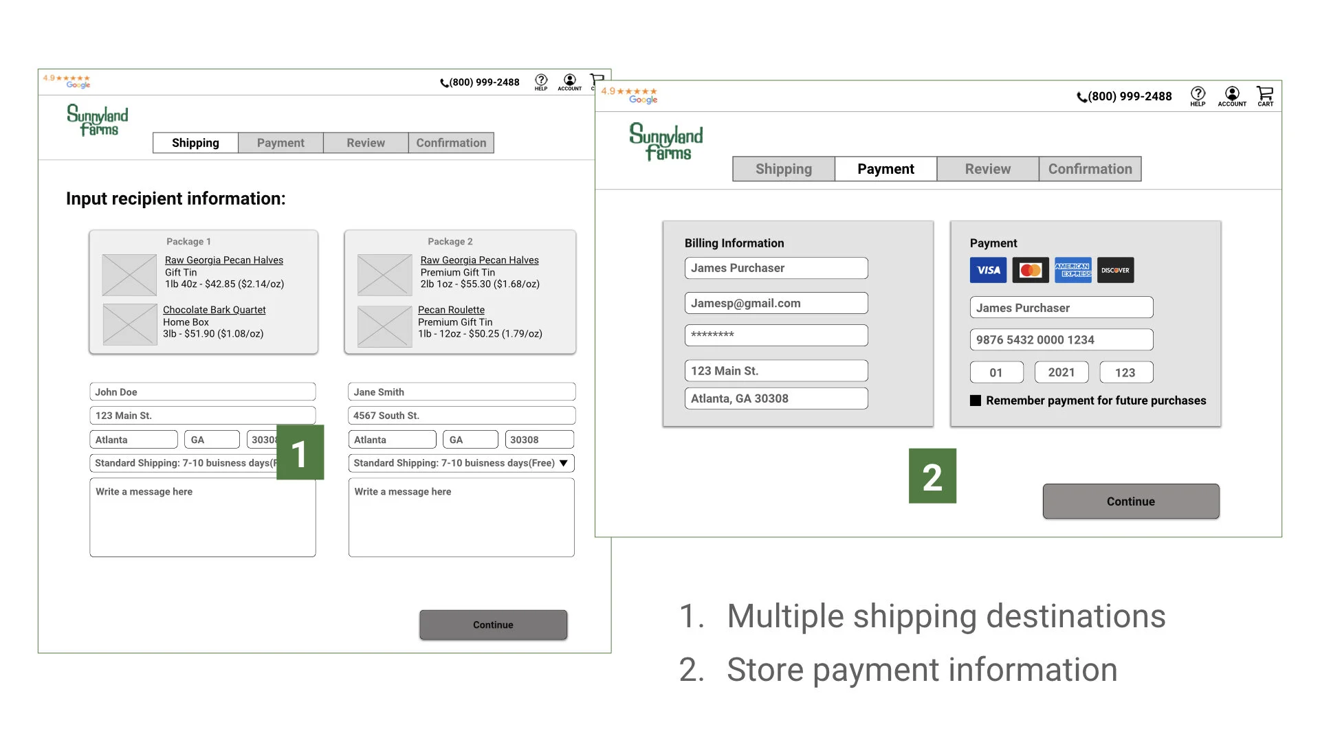
No prompt to create account during checkout
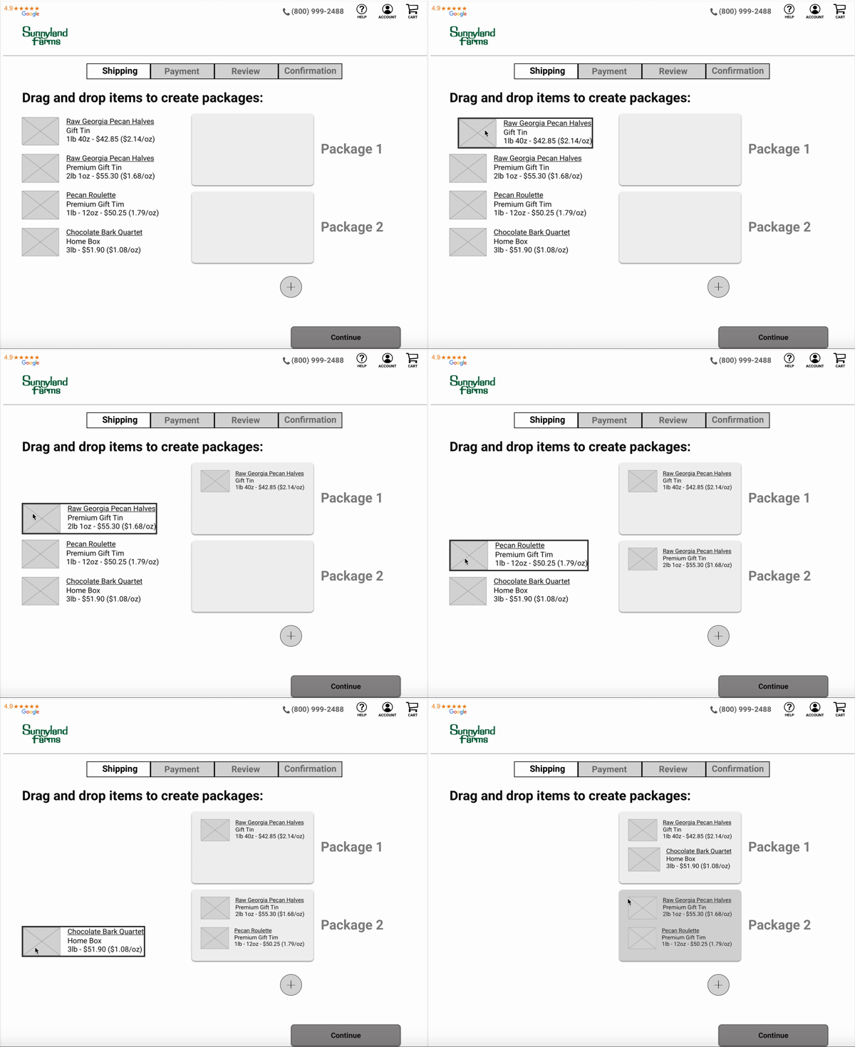
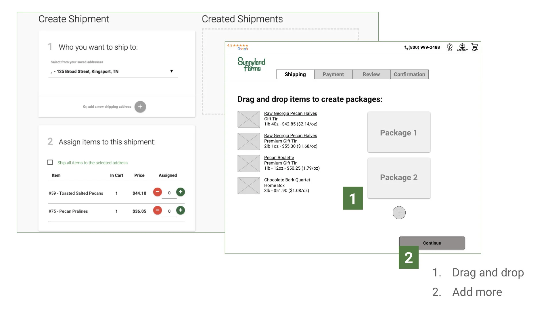
Assigning items to a shipment was challenging
